Animal Crossing: Pocket Camp UI Redesign
Taking notes from New Horizons to enhance the mobile UI.

Disclaimer: I am not affiliated with Nintendo or Animal Crossing in any way. This redesign reflects my own
opinions and choices and is intended only as an exercise.
I’ve been a frequent player of the latest Animal Crossing release, New Horizons, so when I
downloaded and began playing the mobile game, Animal Crossing: Pocket Camp (released
in 2017)
I was excited to have access to the Animal Crossing experience on my phone. However, I found it a little
difficult to get
into the game. While I enjoyed the gameplay, I felt overwhelmed by the interface. From the
start, there were so many things calling for my attention and I had no idea what to do about
many
of them.
The difference in design choices between AC: PC and
AC: NH can
be seen when you look at the splash and loading screens.
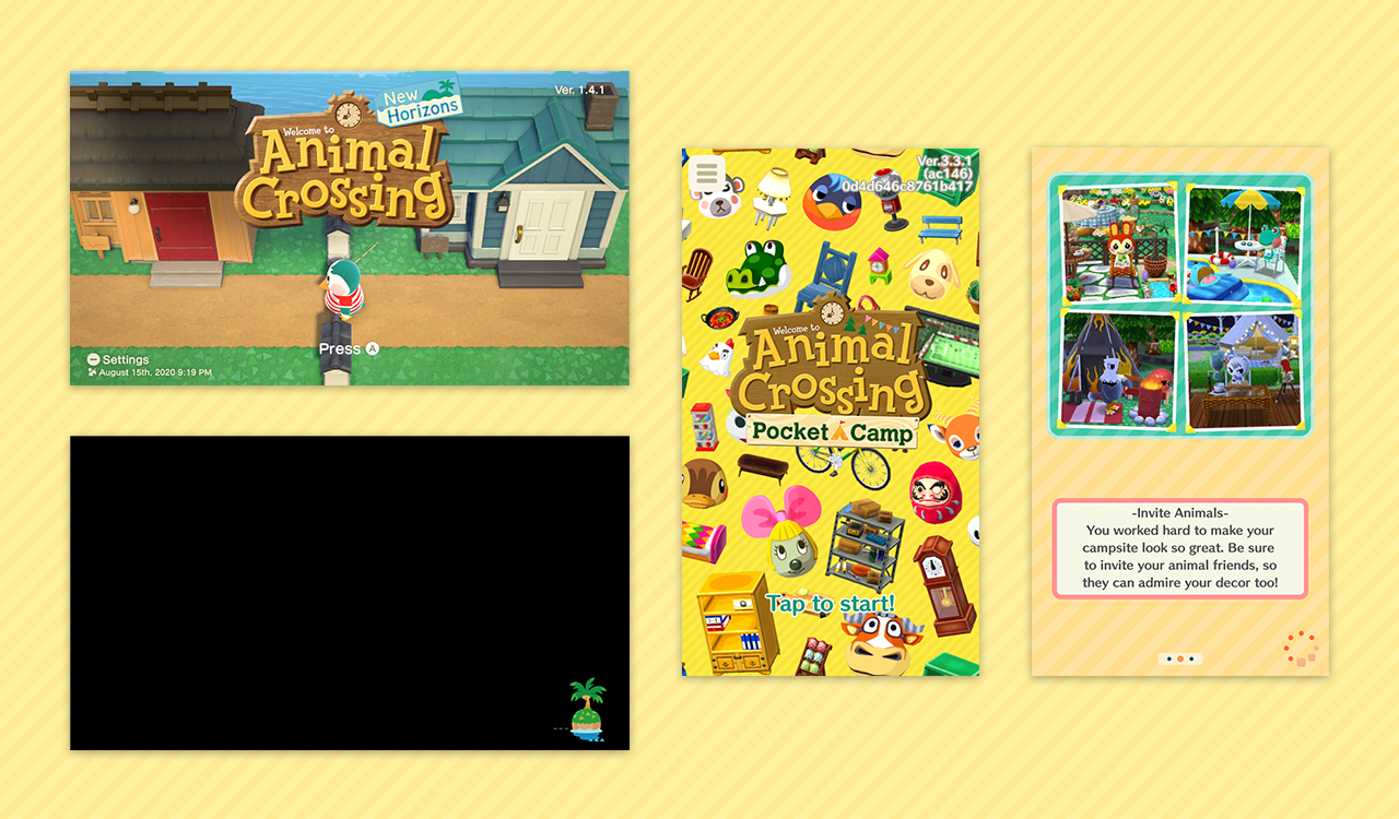
AC: NH
Splash screen - title overlaid on game visuals
Loading screen - black screen with a floating island in the corner
AC: PC
Splash screen - title overlaid on image with scattered game characters and items
Loading screen - game tips with relevant screenshots
The Pocket Camp screens feel crowded to me. They cram as much information as possible
into the small
space of a phone display, and not in a way that is easy to process. This is emblematic of my overall
issues with the game's interface. It feels overwhelming. There are redundant interface elements, and often
multiple things are calling for attention at once. Some of the alerts feel disruptive and difficult to
ignore,
even when they aren't urgent. This feeling is in opposition to the actual game of Animal Crossing, which
is
beloved for its sense of calm and escapism.
I chose to take inspiration from New Horizons in this redesign because it sets a clear example of
conveying all the information
the player needs, not only in limited screen space but with a fairly minimalistic aesthetic to boot.
Although the Switch can be played docked and connected to your TV, I most often find myself playing in
handheld mode, on a screen that's between the size of a small tablet and a large phone.
The one major difference here that I would like to note is that some interactions in New
Horizons are
accessed by going to locations rather than being available through the UI at all times.
This means actions such as crafting and paying off loans don't clutter up the screen, at the cost of
being slightly more tedious to access. Even so, I think there are more actions overall in AC: NH,
and I believe that the UI has to convey just as much information in the end.
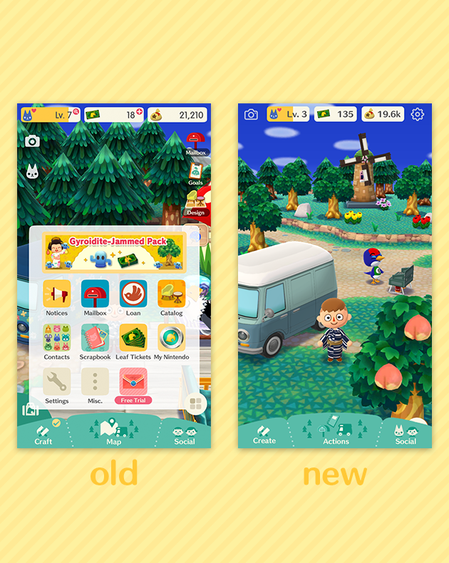
Upon entering the game, there are several subsections of the interface.
- Bottom bar & inventory
- Bottom right pop-out menu
- Top right actions
- Top bar HUD
- Top left actions
I wanted to condense these on-screen elements into one area. I weighed using the bottom bar or the
pop-out menu. The pop-out menu was appealing because it resembles the NookPhone interface in
AC:NH, but
I chose the bottom bar because it can show several options without forcing the user to tap through to
each option.
Elements the game needs to convey:
- Map
- Inventory
- Crafting
- Design
- Friends
- Animals
- Mailbox
- Goals
- Events
- Pocket Camp Club
- Settings
My new groupings:
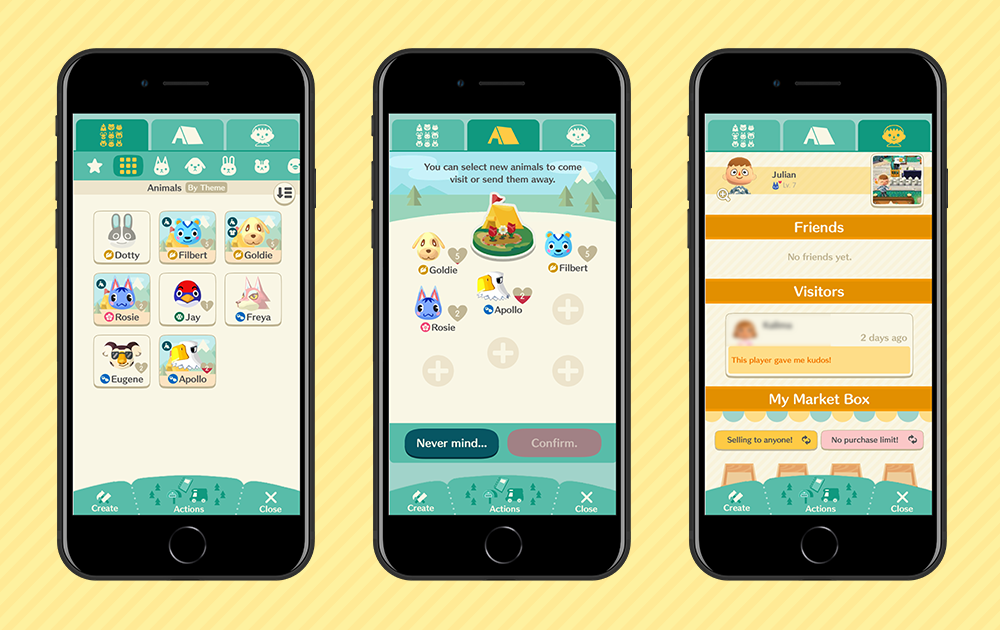
Social:
Covering both friends and game characters, this includes campers,
contacts,
and market
boxes.
Actions:
These are frequently used actions that need to be accessed quickly - Map,
Mailbox, Goals,
Notices, and Events.
Create:
These are fairly frequent actions, but with fewer alerts or scheduled
events -
Inventory, Crafting, and Design.
Infrequent interactions that are not a part of gameplay, such as Misc. (containing customer support,
privacy policy, etc.), subscription status, and My Nintendo will be accessible through settings. I left
the top bar mostly as is but created space on the sides for the camera and settings.
With the new groupings I created, the bottom bar options (previously Craft, Map, and Social) became
Create, Actions, and Social. All three retain elements of their old design. Create and Social both take
the user to a screen where they may use tabs to switch between the elements under that category. Because
the Actions options are frequently used, the Actions button pops out the three options rather than
taking the user to a separate screen each time. These are Mailbox, Travel (renamed from Map to fit the
“actions” theme), and Planner (which is Events, Notices, and Goals condensed into one place).
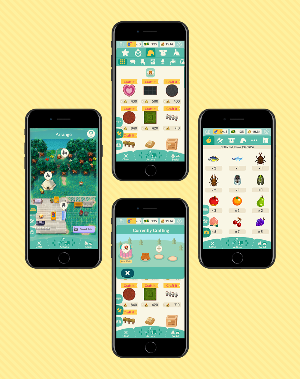
The inventory and craft screens both feature larger icons and utilize more screen space. Items
that are currently being crafted (which can take from minutes to days) can be viewed in a pop-up rather
than taking up space at all times. The Design screen is accessible alongside these other two menus
because it is closely related (inventory/crafted items may be used for camp design).
Both animals and human friends are under the Social category, and animal campers can be managed here as
well. Previously all three of these options were in separate locations.
Overall I feel that I accomplished my goals for this redesign. I was able to
organize many different elements within the interface in a way that didn’t crowd the main screen quite
so much. My design obviously has its flaws and could be improved upon, and I still believe a lot of individual screens
could be made less crowded.
In the future, I still want to address managing alerts within the game in a way that is less disruptive to the player.
Some final notes:
One of the things I appreciate about the AC: PC UI is that it exits the frame during
certain
interactions, i.e. fishing and catching bugs, freeing up a good chunk of the screen so that you
can feel more immersed in the activity.
I enjoy the way that the nature-related tasks -- catching bugs or fish, picking fruit --
correspond to different locations, meaning that instead of equipping a fishing rod, you go to the creek
and you simply have your fishing rod. I think it's a clever way of dealing with it (especially on the
mobile platform) and allows the player to focus on gameplay rather than repetitive UI interactions.
One of my main issues is how the game alerts you to tasks and events.
If I had not been a fan of Animal Crossing beforehand, I might've given up on the game solely
because of the intrusive notifications. While I've learned to mentally tune it out over time, I still
believe this could be handled better. Things like animal requests in your camp (every time you
stand still, a large pop-up appears in the center of your screen) or badges on icons (I usually open the
game to find badges in seven different places, often for things that don't actually require my immediate
attention) feel strangely urgent and stressful for such a friendly franchise.
Regardless, I recommend checking out Animal Crossing: Pocket Camp (as well as
New Horizons).
It's a great game, and I've continued playing past my initial impression of it.